Bank of America: Responsive Design System
Overview
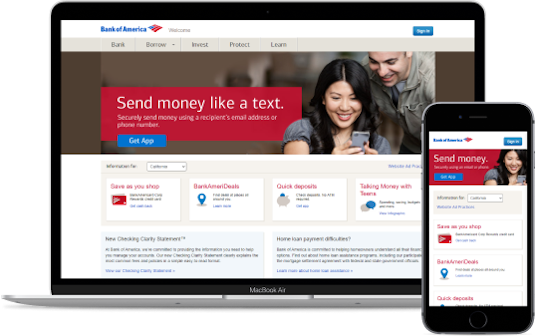
In 2016, many websites were optimized for desktop-only. It was not uncommon for users to visit a site on their phone to see either a broken experience or a "Please visit us on desktop" message.
Bank of America knew it had to modernize, but it needed someone to prove that their complex banking tools could be translated to a mobile viewport.
Team & Role
I was the Creative Technologist on this project, coding the component library. I worked closely with the design team to ensure that anything we designed was feasible on mobile, reassessing the design as issues arose.
The project involved two developers, one UX researcher, one UX designer, one visual designer and one client experience director.
Process
The design and developer teams worked together to sketch out how each element on the page can be broken down into a mobile equivalent. As we coded, we would often regroup and make adjustments to the design as we encounted blockers.
The design system was coded with HTML5, CSS, and some jQuery for interactions like carousels and tabs. Feature detection and CSS fallbacks were addressed with Modernizer (https://modernizr.com).
Results
The deliverable was a responsive design system and six prototypes showing how some of Bank of America's most popular pages can be adapted from a desktop layout into a mobile-friendly version.
The Bank of America team was excited to see that even the most complex elements of their page, like navigation and tables, can be built for a mobile screen.
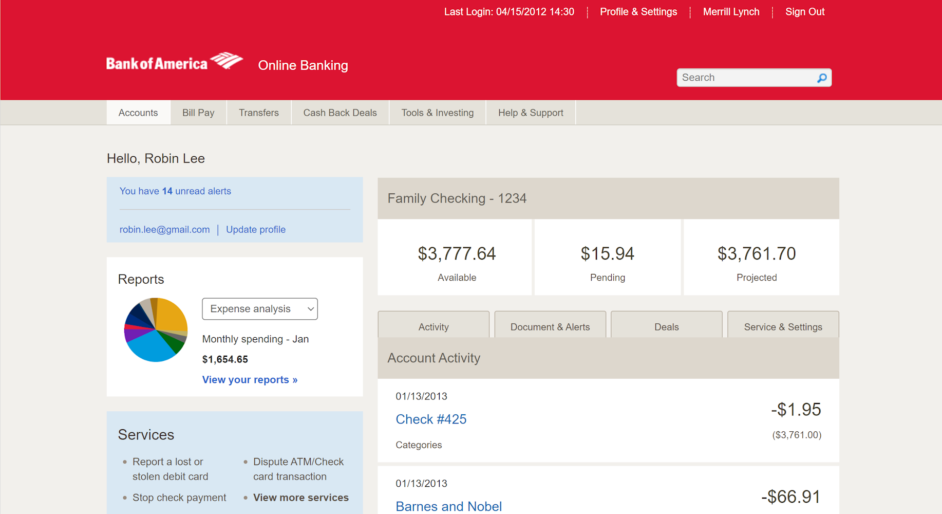
Screenshots
I'm excited about this project because it served as a baseline for BoA's eventual conversion to full mobile-friendliness. Today, Bank of America's banking website is completely mobile-friendly, and I am proud to know that we helped play an essential part in that.
Link
The code for the project can be seen at the link below: