Cake: Holistic UX Audit
Client
Cake (Live link)
Problem Statement
Inconsistencies across styling, messaging and hierarchy created a broken experience for users.
Team
- 1 Front-end Dev (me)
Skills
- HTML/CSS/JS
- Information architecture
- UI design
Overview
As an early-stage startup with a tiny team, the app had evolved from a scrappy prototype to a tool that was used by hundreds of users. We needed to move quickly to make the app look more polished and trustworthy.
As the company's first Front-end Developer, I had the exciting opportunity to suggest improvements for usability, mobile-friendliness, and overall appearance.
Global improvements
Trust and safety were a key need for Cake users, who often uploaded sensitive documents and shared highly personal details about their end-of-life wishes. It was important for the site to feel authentic and trustworthy.
I conducted a complete evaluation with the goal of making the site look polished, cohesive and reflective of the company brand. Some highlights:
- Brand Integration: Added the company logo to the navigation and used the brand's colors (light teal, dark teal, and cream) to make the website look more official and less like a prototype.
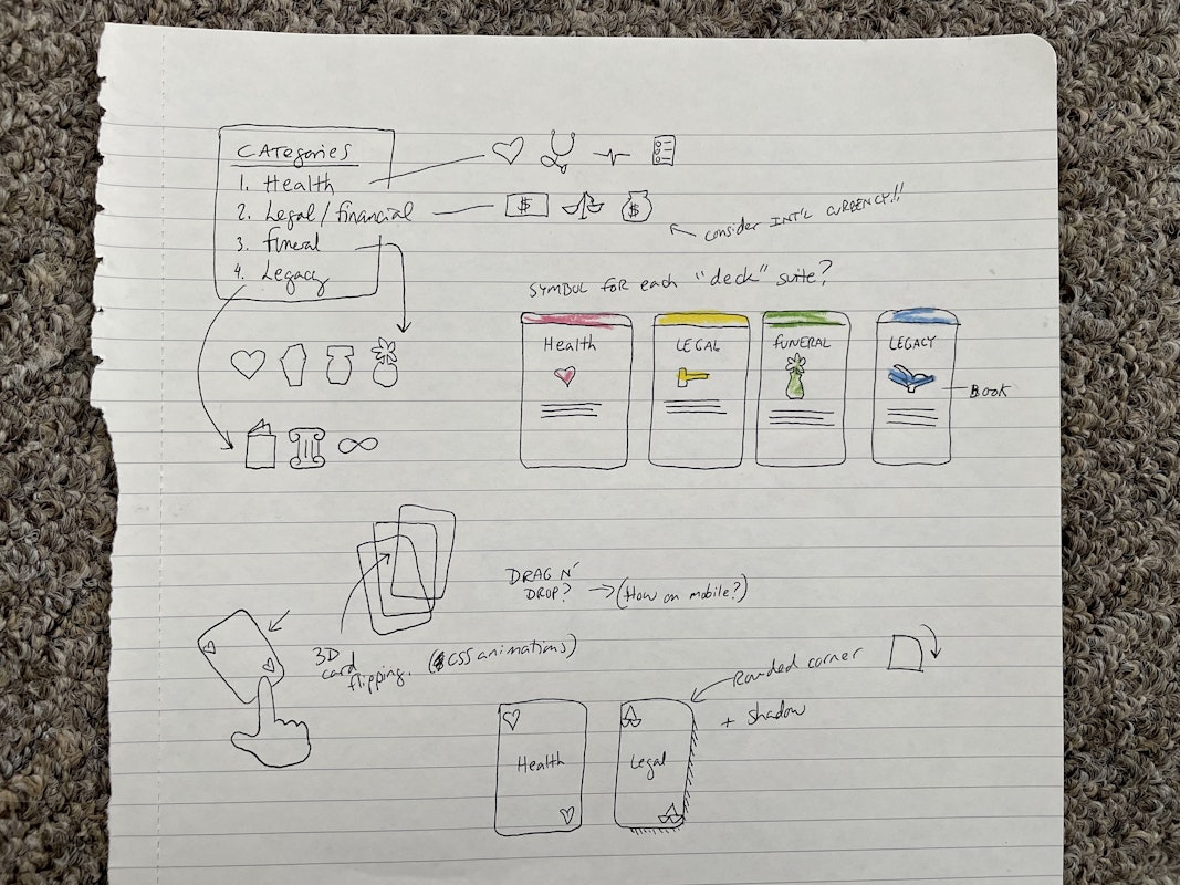
- Icon Tweaks: Updated box-like icons that resembled checkboxes, which could confuse users. Also, I removed ambiguous category icons from the navigation.
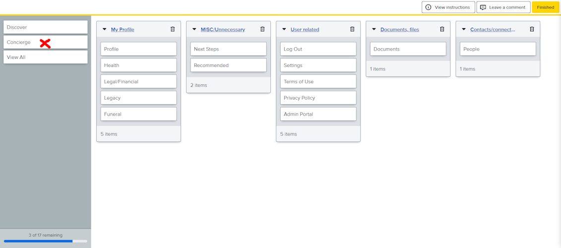
- Simplified IA: As a developer, it was clear to me that the nav had grown over the years to accommodate a rapidly changing number of tools. I proposed a new sitemap addressing redundant or ambiguous links, merging the bulk of "Discover" links into a single parent named "Checklist".
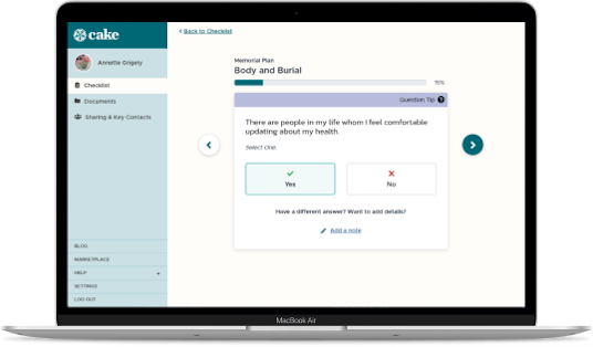
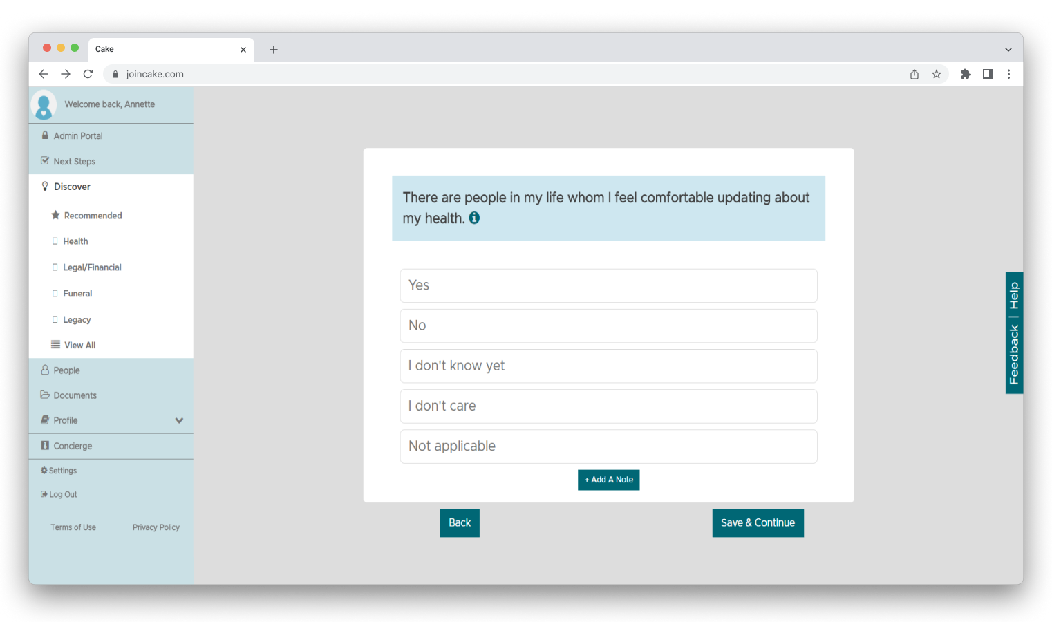
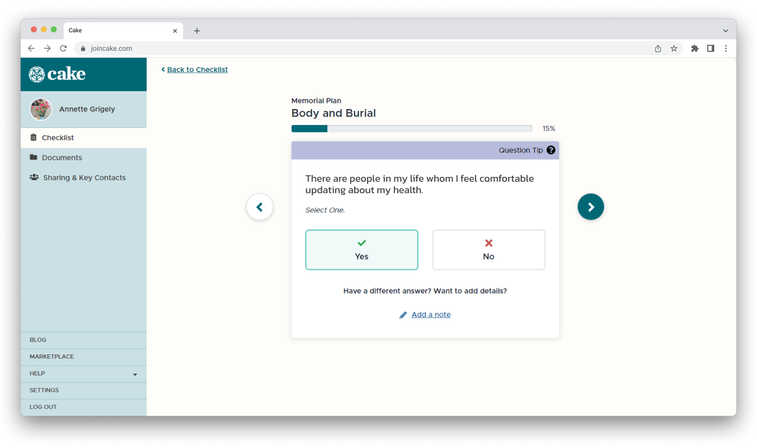
Improvements to the Discover page
Every new user started with the "Discover" tool, so we needed to get this part right. The tool was designed as a virtual deck of cards that a user can flip through and answer crucial questions about their healthcare and funeral/burial preferences. Key changes included:
- Card-like Aesthetics: Redesigned the "Discover" tool to emulate a deck of cards, incorporating rounded corners and themed borders to enhance the visual resemblance to a playing card.
- Swipe Functionality: Expanded user interaction by introducing swipe gestures. In addition to the existing "Back" and "Save" buttons, touch-activated arrows were integrated, allowing seamless swiping on mobile and tablet devices.
- Touch-friendly fields: Improved mobile usability by enlarging answer buttons, meeting minimum recommended sizing for touch points. Iconography was also introduced to clearly indicate yes/no answers.
Screenshots
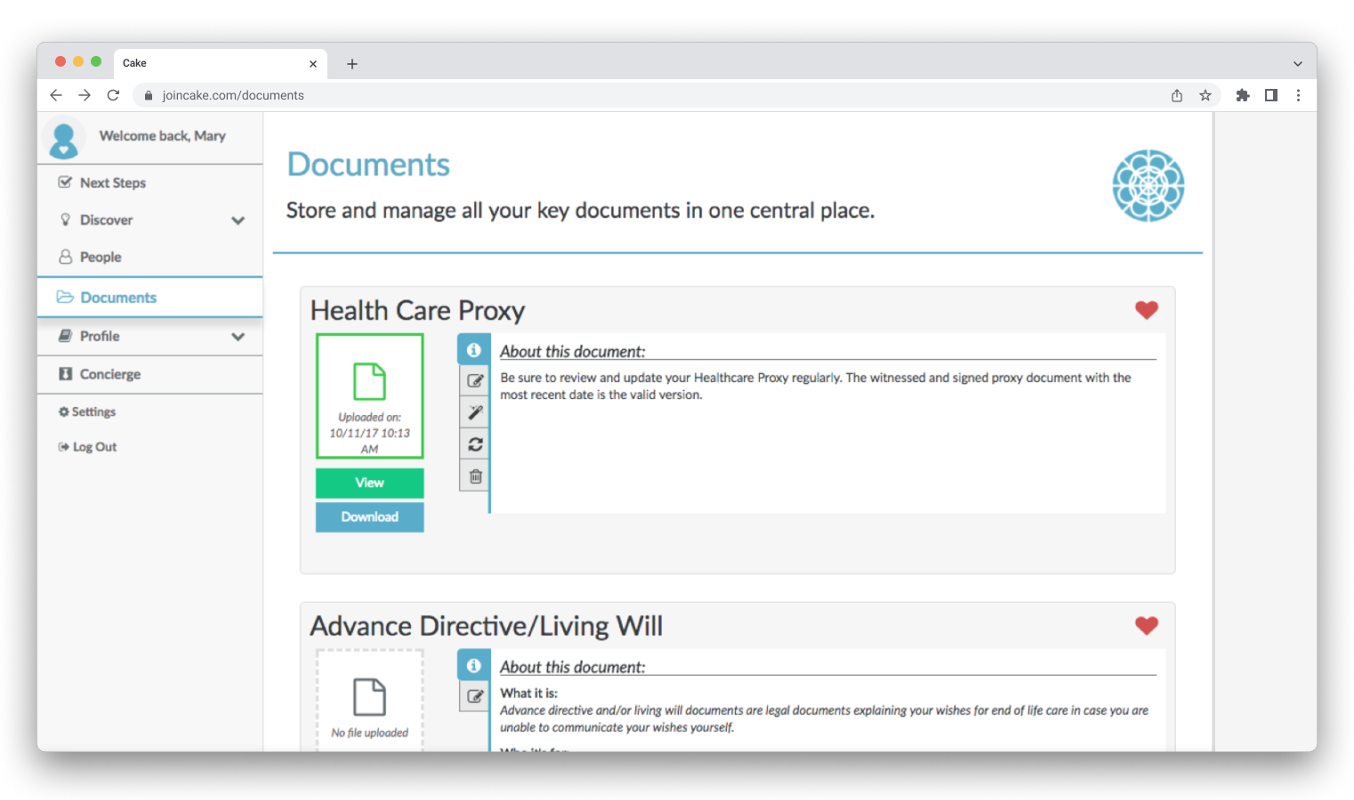
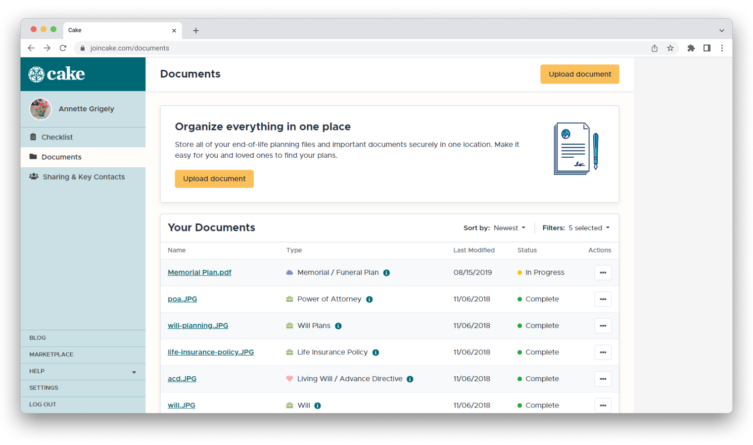
Improvements to the Documents page
The Documents page served as the platform for users to upload vital files such as Wills or Health Care Proxy forms. A notable concern was the rigid design that assigned specific slots for document uploads (e.g., Wills could only be uploaded to the "Wills" box).
This approach assumed users (a) had all documents ready, (b) knew each document's purpose, and (c) had no need for uploading documents beyond the provided slots. I proposed the following changes:
- Flexible Document Upload: Instead of confining users to pre-assigned slots, I recommended letting users upload any document they deemed important and subsequently categorize it (i.e. Type) according to their preferences.
- Revamped layout: Adopted a design pattern akin to Dropbox or Google Drive, where files are presented as a list. This created a cleaner and more familiar display of files but also proved to be more intuitive.
Accessibility
I applied several trivial fixes that would go a long way in improving accessibility scores. Changes included adding tab indexes, alt tags and checking for keyboard trapping. And for fun, I ran the site through the JAWS screen reader several times and discovered many opportunities for improvement.
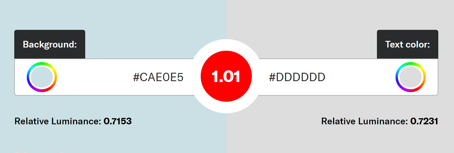
The site's heavy use of pastel blue raised concerns about contrast and visibility. I ran the colors through a contrast ratio test, confirmed that the ratio didn't pass, and then introduced new brand colors that passed.
Results
Over the next few months, this is what we observed:
- Increase to the number of users who returned to the site
- Increase to the number of users uploading one file
- Increase to the number of users uploading multiple files
- Decreased calls to Customer Support
- Improved Google Lighthouse scores, improving SEO
- User interviews showed an overall theme of increased trust. (Less use of terms like "sketchy" and "broken".)
Allowing the user more flexibility in uploading files gave us important insights about what document types were important to them. For example, the page had previously focused on Wills and Health Care Proxies.
After the changes, we observed users begin uploading other documents we hadn't thought of -- like family photos and personal notes to loved ones. We learned a lot about what our users found important, which helped pave the way for several future improvements to the app.