Cake: Fundraiser Platform
Client
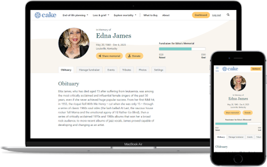
Cake (Live link)
Problem Statement
Users of the app often left the site to create a fundraiser using an external tool.
Team
- UX Designer (me)
- 2 Front-end Devs
- 2 Back-end Devs
- 1 Project Manager
Skills
- HTML/CSS/JS
- Sketching
- Wireframing
- User flows
Context
Cake provided a digital platform that made it easier for people to do advance care planning and end-of-life planning. The platform included tools and guides for creating key documents like estate plans, living wills and funeral checklists.
Overview
After the successful launch of Cake's Memorial Page Maker, the next challenge was tackling one of the most significant pains of users -- paying for funeral costs.
I observed that many users were including external links to GoFundMe in their Cake memorial pages. This was a problem because it increased the risk of users never returning to our site. This was also a problem for app users, because using external tools can create a disjointed experience where they would have to log into multiple websites to make updates related to the same event.
I designed a fundraising tool that would provide a way for funeral hosts to create a fundraiser, promote it and track progress toward a goal without leaving Cake. I researched payment processing integration to ensure an experience that felt secure and seamless.
Who am I designing for?
The Memorial Creator is how we referred to the user creating the memorial page. This is usually a friend of family member of the deceased.
- These users were predominantly within the 30-49 year old range.
- These users had varying levels of tech-savviness but were generally familiar with making profiles on social media sites like Facebook.
The Memorial Guest is how we referred to the user visiting the memorial page. This is usually someone who wants to find more details about the funeral or learn how they can be supportive.
- These users appeared to be from no predominant age group. However, age data was limited because we did not require guests to tell us their age in order to view or use a memorial page.
- These users had varying degrees of experience with making payments online. Most were aware of services like Paypal, but often cautious of those services.
- A significant amount of users preferred to donate to funeral events with tangible cash or check.
Process
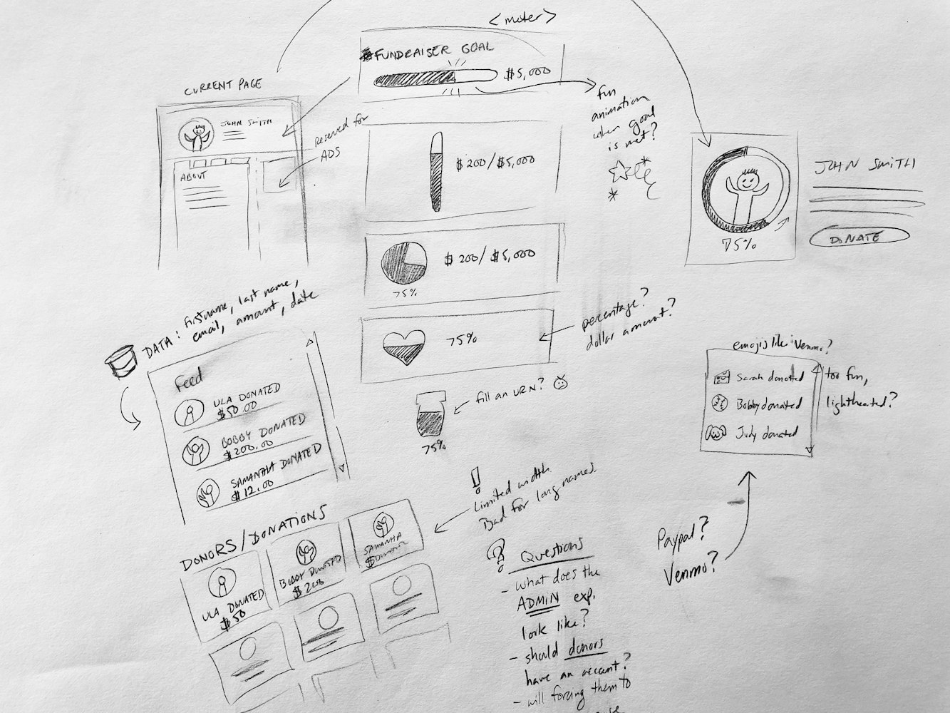
Sketching
I started by getting my initial thoughts and observations down on paper. I find it helpful to start a project by letting all my thoughts out so I can figure out what to focus on first.
My early sketches focused on different ways to display a fundraiser, exploring traditional patterns like a meter as well as more unusual patterns like a heart-shaped pie chart.
Sensitivity and tone were two themes I kept in mind as I sketched. Raising money for a funeral is not the same as raising money for a marathon. It was important to not convey a cheery vibe.
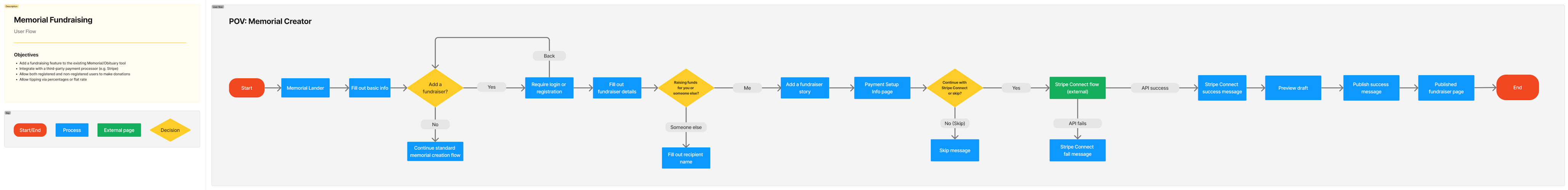
User flow
In crafting the user flow, my focus was making things easy and brief to avoid adding to the decision fatigue that already comes with planning a funeral. I wanted to reduce the frustration of navigating to different parts of the site to accomplish related things.
To achieve this, I centered my flow around a single branching question, asking users if they were interested in a fundraiser at the time of memorial page creation.
If the user said yes, then fundraiser fields would be revealed. If they said no, they wouldn't be bothered with more questions and could continue making a memorial page. No prodding, no FOMO messaging.
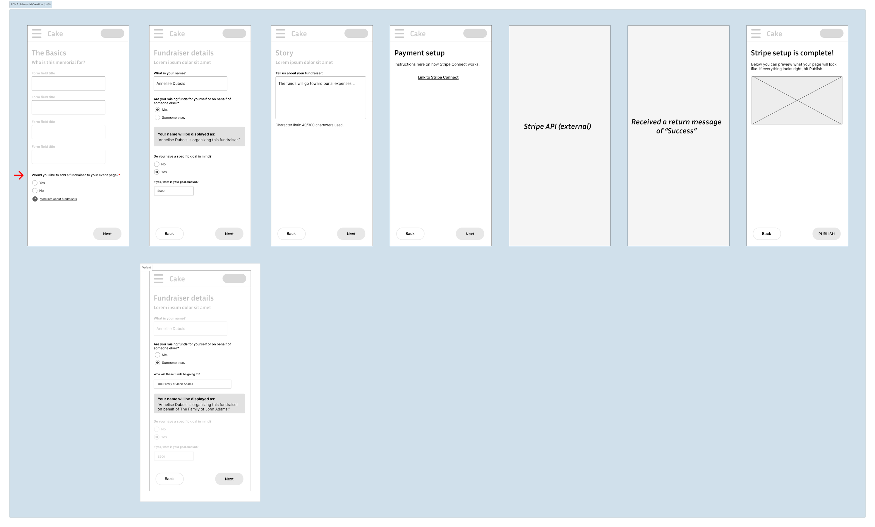
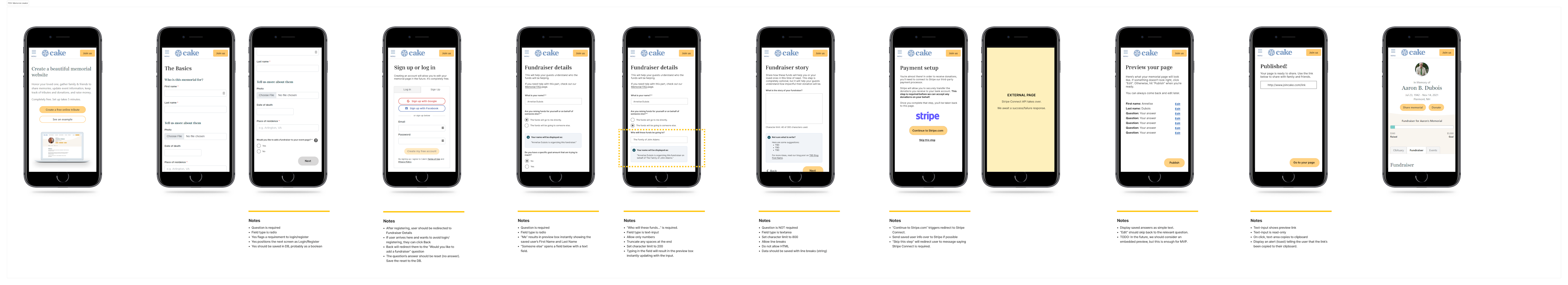
Wireframe (Low Fidelity)
When working on the design, I kept in mind the feelings and emotions that Cake users most often mentioned:
- Fatigue. People planning a funeral are often tired and may require more breaks to complete a process, sometimes stepping away completely.
- Confusion. Most people planning a funeral are doing so for the very first time and can feel confused when presented with unfamiliar terms. (e.g., "columbarium", "direct burial")
- Distrust/wariness. With identity theft and scams on the rise, many users approach unfamiliar apps with increased caution, especially where money is involved.
I wanted to create an experience that felt simple but trustworthy. Because grieving users are especially susceptible to becoming overwhelmed, it was important to guide them at their pace and comfort level.
I grouped questions in small clusters, with a max of 3-5 questions per screen. This way, the flow allowed for pauses, potentially lessening cognitive load.
While designing, I frequently cross-referenced the Stripe API documentation, to ensure consistent messaging across services. (For example, while Cake charged no fee for fundraising, I discovered that Stripe charged a small fee for bank transfers. It would be important to convey this to users on the Cake side.)
Wireframe (High Fidelity)
After iterating through a few lo-fi designs, I created a high-fidelity wireframe that outlined styling direction.
As a developer, I also thought it would be helpful to add annotations about form field behavior, error validation and what API responses to expect from the payment processor.
Deliverables
The project took about 1-2 months between design and coding, followed by further testing. The new design added a fundraising progress meter, buttons to initiate donations, a fundraiser donation form and a dedicated tab to show a list of recent donations.
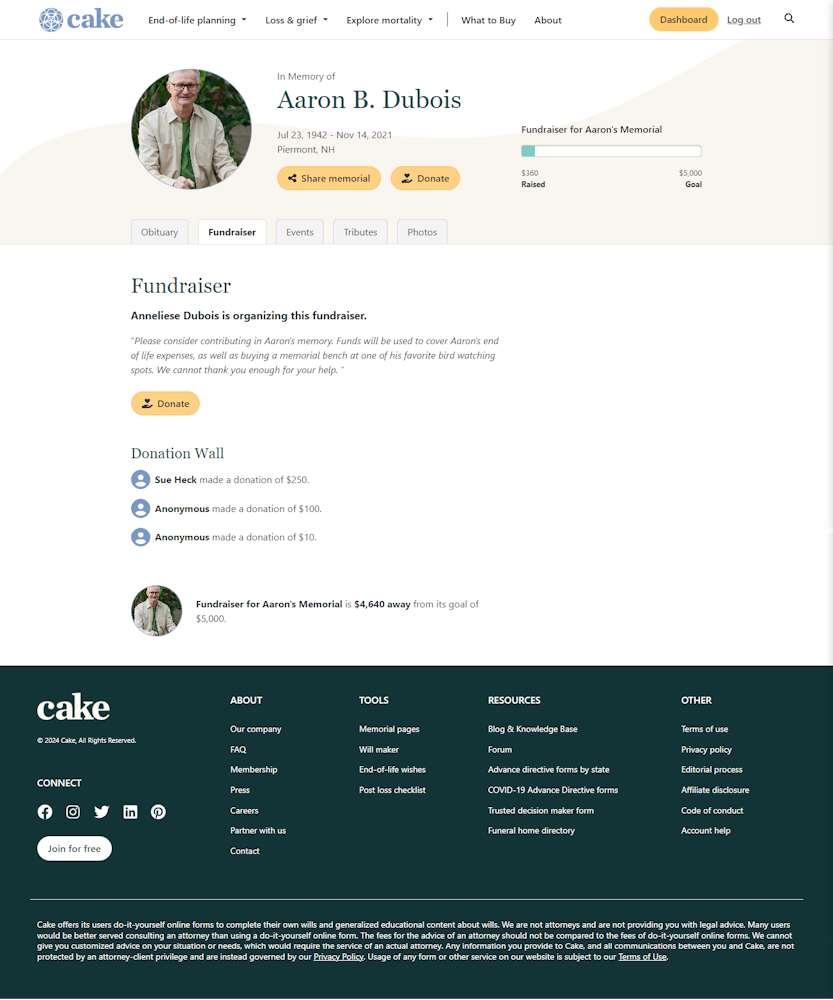
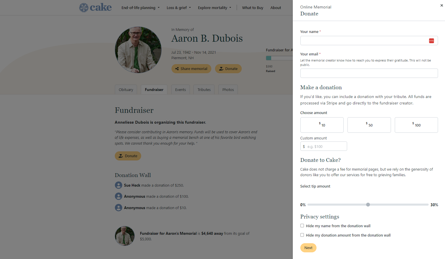
Results
Just a week after launching the fundraising tool, we were thrilled to see our first users successfully adding fundraisers to their memorial pages. Some highlights:
- Initial feedback from users (via surveys) was positive
- Fewer requests to customer support for help
- Fewer linkbacks to GoFundMe and other external fundraising tools
- Increase to returning users
Takeaways
I'm proud that I was able to take on the design of an entirely new feature utilizing a service we hadn't tried before (external payment processsing). It felt meaningful to be designing for something I care for so deeply.
Surprisingly, even in the design phase, I found that my developer experience was extremely valuable because I had an innate sense of technological feasibility. For example, I knew that hiding form fields based on how users had answered earlier questions was trivial (as long as we were clearing out data between toggles.)
If I were to do this project again, I would want conduct more usability testing on the lo-fi prototypes. Due to time constraints, we weren't able to do this kind of testing. But I feel that it could have revealed insights that simply aren't available via quantitative data.