VA.gov: Responsive Design System
Client
VA.gov (Live link)
Problem Statement
The VA was maintaining 10+ apps with duplicate styles, creating a frustrating experience for devs and VA clients
Team
- 2 Creative Technologists (me)
- 2 UX Researchers
- 2 UX Designers
- 1 Visual Designer
- 2 Project Manager
Skills
- HTML/CSS/JS
- UI design
Overview
In 2016, the VA maintained several apps for use by Veterans and clinicians. Over the years, many of these apps became the responsibility of different groups that didn't work with each other every day. There needed to be a central reference for how a VA app should look and feel.
The VA asked Mad*Pow to do a heuristic evaluation of their app portfolio, taking inventory of inconsistencies such as different versions of colors or form elements.
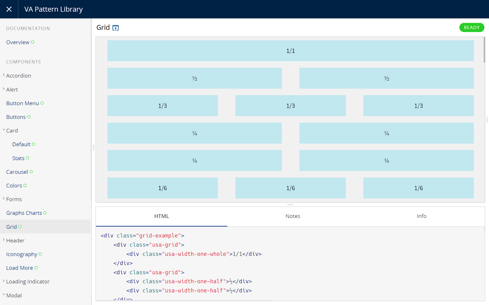
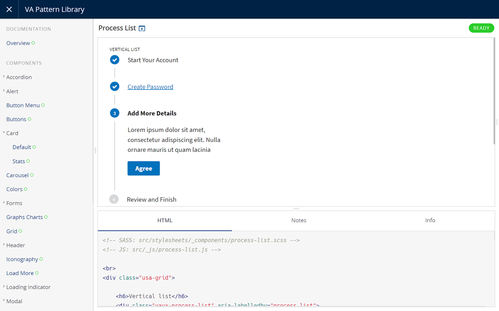
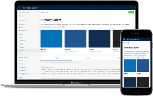
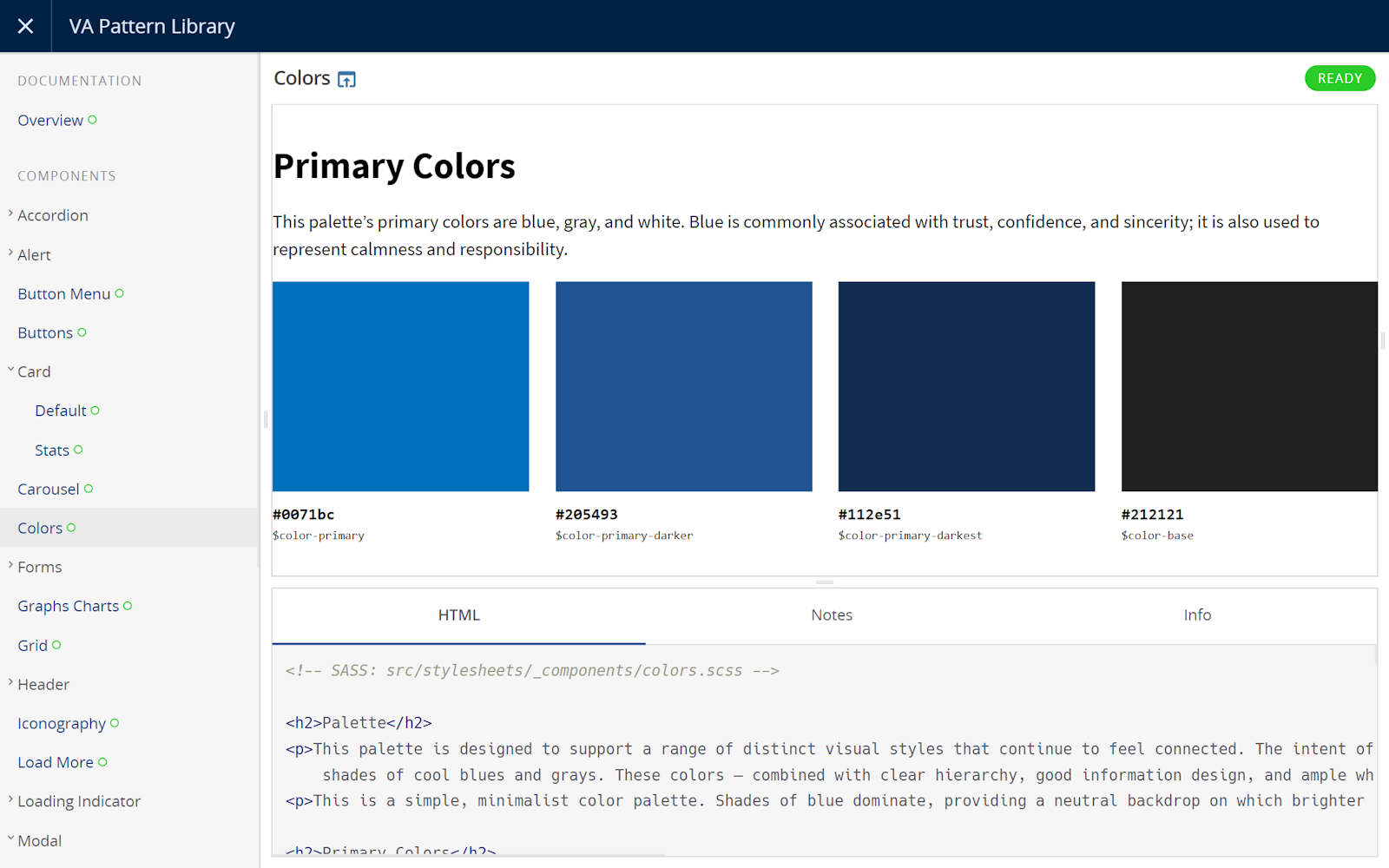
- Coded generic component and template library consisting of high-priority UI patterns
- Component taxonomy guide to create a common language for what elements are called. (e.g. "modals" versus "pop-ups")
- Written documentation contributions to the VA Human Factors Engineering (HFE) team’s UX Guide, detailing industry best practices for using for each pattern
Team & Role
I served as a Creative Technologist on this project, coding the component library. I worked closely with the design team to ensure that anything we designed was feasible on mobile, reassessing the design as issues arose.
The project involved two developers, two UX researchers, two UX designers, one visual designer, one project manager and one client experience director.
Process
From the development perspective, we used HTML, CSS (SASS), JavaScript (jQuery, Handlebars) and Fractal to build the core of the component library, making sure to include detailed documentation for future VA developers.
It was important for us to adhere to Section 508 accessibility guidelines, and we used tools like Axe to verify that everything we built followed the rules.
Instead of starting from scratch, we recommended that the VA leverage the US Web Design Standards (USWDS), a set of guidelines that was released a year prior and being rapidly adopted by several government entities. The USWDS was a great tool for quickly booting up a government website, and we felt it wasn't necessary to reinvent the wheel for things like color and typography. We also wove in the principles of Brad Frost's Atomic Design, which emphasized using small, modular components to serve larger, more complex templates.
One problem with the USWDS was that it focused only on website components, so we made sure our components were ready for mobile use. We constantly tested our code across both emulated and real devices. (At the time, Mad*Pow maintained a device library of over 20 mobile and tablet devices, ranging from old Nokias to the latest iPhone.) This allowed us to use a fine-tooth comb when it came to finding bugs or features that had poor support on mobile.
Screenshots